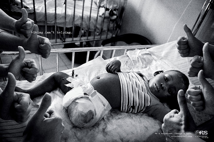
Colour:
This advert is in full black and white, this shows negativity and seriousness. This relates well to the theme of the advert as its a very serious topic. There is also a heavy grain filtered on this image to give it a very dull and sad look to the viewers. Having this dull and negative look will keep this advert imprinted in the audiences brain as they may think back to how sad this image is, they wouldn't be able to be affected by this image as well if it was in full colour.
Setting:
In this advert, we can see that the setting is inside a unclean, poor hospital. This is because the sheets on the patients bed is very dirty and creased up. This shows that this poor, sick young patient is living in extreme difficulties in a third world country as he isn't getting the best treatment. This may show how fortunate people in the UK are as they get top quality medical care where as children in need do not. This is important as it keeps a serious and very negative feeling in the audience which helps create a more effective, powerful advert.
Lighting:
The lighting in this image is High Key as it is lit by natural light. Although the shadows are very harsh and dark which shows drama, negativity and seriousness. There is also some slight vignetting which brings more attention to the centre and in this case it is the young patient, this is very effective as he is the main subject. The hands coming out the sides of the image are very dull as they are coming out the shadows. The hands represent social media Likes and how images of third world crisis' are always being uploaded to social media and gaining likes but the likes don't help the cause at all. This is why the hands are lit to be coming out of the shadows.
Size/Framing:
The subject and focal point go the image (the young patient) is zoomed into to fit the frame to give the illusion of him being very big, where as the hands representing likes are rather small which show importance. It shows that the young boy is the main importance of this crisis and the likes don't mean nothing at all. The copy is very small and simple to show seriousness and maturity. It shows that the image is powerful enough to speak for itself, which it does.
Pose:
The young boy in the hospital bed has a very straight face and maybe even a little confused. He may be confused to the thumbs up around him as this can signify the likes social media receive but don't make a difference. The pose of the hands are thumbs up which signifies how likes don't help the real cause.
Subject Matter:
Many bad things are happening in this world, but yet there are people that are uploading images about these causes only for attention and 'Likes". this image shows that these "likes" do not help the real people that are being untreated at all. They have used this type of cause as they're are many children that are dying everyday and yet many people do not help at all but just talk about it.
Composition:
This image is composed very well as it is very simple and minimalistic but very, very powerful. The director has come up with a very affective idea to link a real life problem that happens every day with something people use and interact with everyday. A simple click of a button can produce a like where as a click of a button could also help someone in need.
No comments:
Post a Comment